


Why I Believe CRO is an Ongoing Process, Not a One-Time Fix
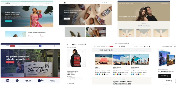
Ever seen a Shopify Store that screams “PLEASE LEAVE?”
TBH, some web-designs let us do likewise….
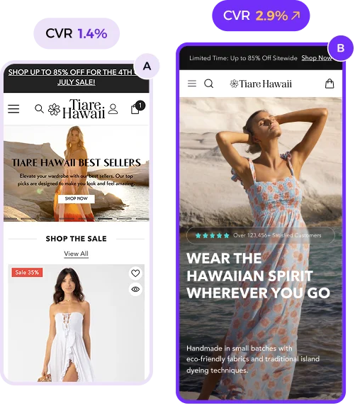
Mistake No.1 Pop-up chaos
→ Pop-ups right away within 0.5 second.
→ Mobile users hate this bombardment.
Here’s how i do the fixes of it:
Exit intent popups are gold.
⤷ Delay triggers until users engage.
⤷ Set 10 sec delay & 2 additional page views by visitor
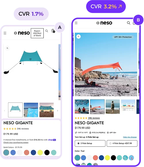
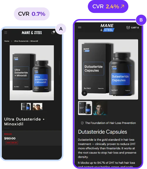
Mistake No.2 PDP – Product page overload.
→ Too much textual info kills focus.
→ Because customers need clarity, not confusion.
Solution?
⤷ Highlight benefits, price, and CTAs.
⤷ Additional Product Info? Tuck them into expandable accodrions.
Mistake No.3 Mobile navigation nightmares.
→ Overcrowded menus make users abandon ship.
→ Over 70% of traffic is mobile.
→ Messy navigation = lost opportunities.
What’s better?
⤷ Clean, collapsible menu items.
⤷ Show key categories upfront.
⤷ And don’t forget a prominent search bar!
Why Does it Cost Sales?
- Pops up: Leads to hard exits, increase Bounce Rate & Drop-off rate
- PDP: Distract visitors to focus on the primary buying decision
- Nav: Causes abandonment & leave user to go nowhere.
Moral of the story?
A good Design shouldn’t just be fancy & pretty.
It should SELL
SO, Avoid these 3 Uncommon Mistakes.
Watch your sales soar:)