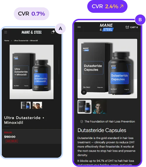


UX Design Myths That Might Be Hurting Your Shopify Store
Why do your customers get frustrated while checking out…
This is how to fix It!
On clicking “Checkout Button”
There comes a frustrating form.
Suddenly, you’re stuck because there are too many fields to fill.
It gets worse on mobile phones….
Because of
⤷ Tiny field sizes & sometimes auto-zoomed-in
⤷ Accidental wrong button hits
It’s frustrating, right?
Now imagine what your customers feel.
So, let’s fix this.
Keep forms simple.
⤷ Only ask for what’s necessary.
Nobody wants to write a novel just to buy socks.
Enable autofill & auto-complete.
⤷ Show big input fields of a 45px min-height.
Error messages?
⤷ Be kind and clear.
⤷ Tell them what needs to get corrected
Offer guest checkout.
⤷ Let users buy now, register later.
Save their info for next time.
⤷ Pre-fill details and make repeat shopping a breeze.
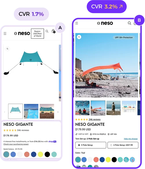
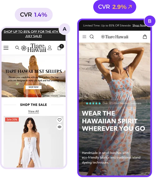
And don’t forget testing.
⤷ A/B test the flow.
⤷ Find what frustrates users and fix it. (hotjar recordings)
Because happy users? They don’t just complete purchases. They keep coming back.