


 Date
Date Read time
 Topic
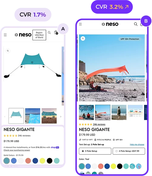
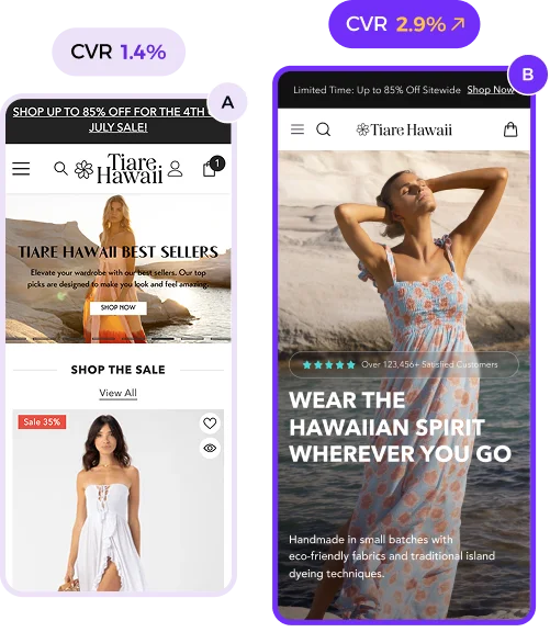
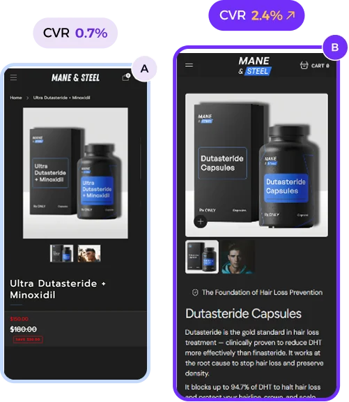
TopicDo Not Optimize Your Store Design for Smaller Screens Like This!
Ever tried squeezing a giant sofa into a tiny room?
That’s what happens when you cram desktop features into mobile.
Mobile users get a cluttered mess, not a smooth experience.
→ Tiny buttons? Good luck tapping those!
→ Minimalism is great until it frustrates users.
Full-screen pop-ups with tiny exits?
→ Cue instant exits from frustrated shoppers.
→ Pop-ups should be subtle, not in-your-face.
Poorly spaced text? Hard to read!
Small fonts on small screens? A recipe for disaster.
And the worst—complex menus.
→ They don’t translate well to mobile navigation.
The desktop features you love?
→ They might just ruin the mobile experience.
Aesthetics are important, but functionality is king.
Mobile-first design is a must, not a suggestion.
It’s about balancing beauty with usability.
Optimizing for small screens requires smart design choices.
Don’t let your mobile users drown in desktop clutter!
Prioritize ease, not just looks.
Trust me… your conversions will thank you.


